

In light of the sluggish recovery and concerns about the state of inequality in the United States, more attention has been turned to understanding how labor wages have compared to profits and productivity.
You may have already seen the graph below that suggests that productivity has been climbing steadily, while compensation has stayed relatively flat:
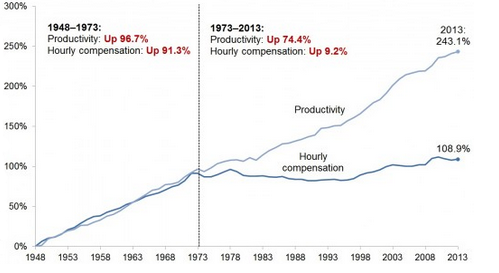
The Atlantic has an article that suggests this is driven by technology, globalization, the decline of labor unions, and a lack of “investment in the commons.” It seems a straightforward picture, and a quick look at it may provoke a certain emotional reaction.
Something to consider: what do “productivity” and “hourly compensation” mean in this graph? When we start to dig, we see the picture become fairly complex, pretty quickly.
Looking at the Bureau of Labor Statistics, “productivity” is defined as such:
“Labor productivity, or output per hour, is calculated by dividing an index of real output by an index of hours worked of all persons, including employees, proprietors, and unpaid family workers.”
The Economic Policy Institute, which originally created the graph, defines “hourly compensation” as “hourly compensation of a typical (production/nonsupervisory) worker,” which means we’re capturing some sector of the market that’s not complete. EPI says that it’s the “vast majority” of workers, but here’s what we don’t know:
-
How large is that group?
-
How much has the size of that group changed?
For example: the manufacturing and agricultural sectors have declined significantly in the US as a % of the total labor force, while the service sector (including professional services like engineering, programming, finance, and management) has grown.

While the entire service industry isn’t driven by professional services, it leads us to wonder: how have professional service employees’ wages changed over time, and how large a sector of the labor force do they represent? What percentage of the US labor force has moved into those supervisory and management roles, whose wages are not included in the graph, as the US economy has become more integrated with overseas production?
That’s not to say that there is conclusive evidence that wages for large groups of the US employees aren’t stagnant. But in the US there are 4 million (and growing) unfilled jobs (representing 2.6% of the US labor force, compared to a 5.5% unemployment rate), many of which are in skilled labor positions, whose wages have been rising significantly as demand for them has grown.
When we start digging into the data and asking some questions about what’s really going on, we see both that the situation can be much more complex than stated in a simple graph, and that the causes (and potential solutions) might not be what match our knee-jerk reactions.
Next time you see a graph or other simple collection of data that sparks an emotional reaction, ask yourself: is this graph suspiciously simple, and are the reactions to it similarly suspiciously straightforward? What can we learn if we dig further down?
29 Comments